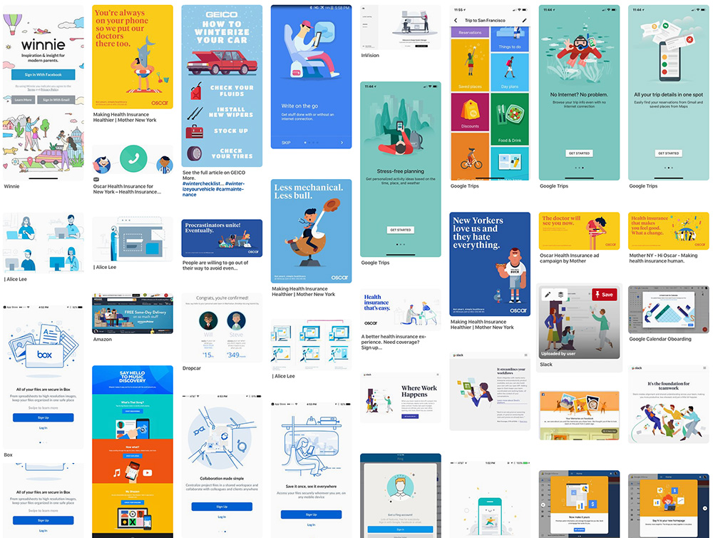
Khoi Vinh noticed that tech marketing adheres a very specific, somewhat infantilized illustration style. I call it safety minimalism—Vinh sees in it the rise of a monoculture.
In my experience, the vast majority of them are quite similar in their aesthetic: the colors range from primary to bright pastels; the figures are cleanly drawn and almost always rendered with vectors; the details are highly abstracted and shading is geometric if it appears at all; the compositions are generally minimal and only occasionally feature very limited background elements. ... It probably wouldn’t be far off-base to assume that a lot of these illustrations were done not by professional illustrators but by product designers who also have some illustration talent themselves.
Just as likely is the genre's systemic infection of cheap stock illustration sites, which aggregate semi-skilled hackwork into a convenient business-to-business service.
Either way, Vinh poses an important question about "the prevalence of a single, monocultural aesthetic" by every startup, tech firm and brand monster: surely some other voice, or even another "modulation" of the same style, be more appropriate for at least some?