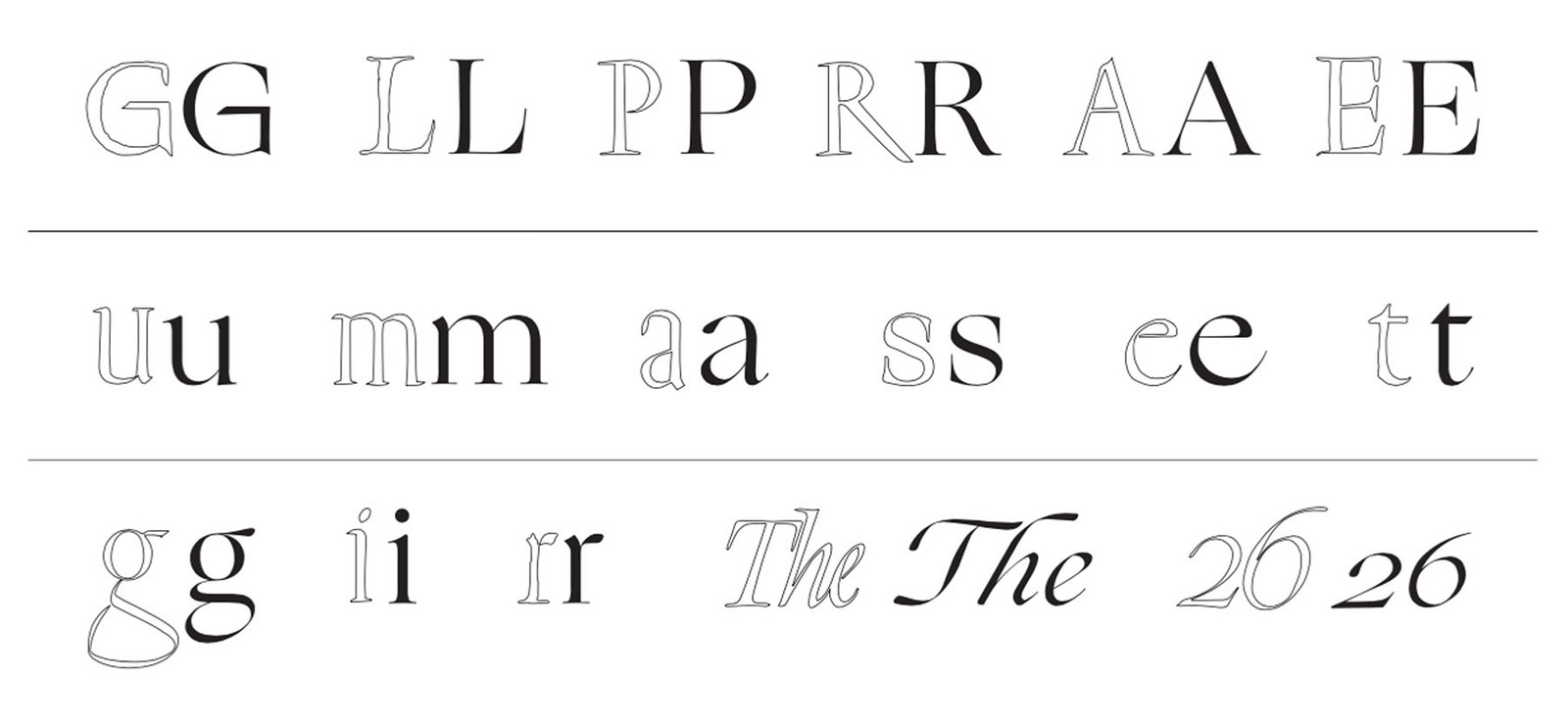
Bethany Heck's Font Review Journal is dedicated to criticism of fonts, and itself very handsomely typeset by Phil Moody. The latest in-depth review is of Lucas Sharp's Ogg.
My goal isn’t to prescribe a number score or valuation on a typeface — rather, I want to celebrate, analyze, demystify and inform designers who are looking to improve their typographic choices. I won’t be reviewing any fonts here that I don’t personally use and see value in. Designing a typeface is a herculean effort that takes hundreds of hours and often years of time to refine and complete. My aim is to show appreciation for these works of art through thoughtful discourse, aesthetic studies and historical context. There is often a gulf in the communication between the type design community and the designers who put their work to use, and I hope this site serves as a sort of bridge to bring the two practices to a closer understanding of each other.