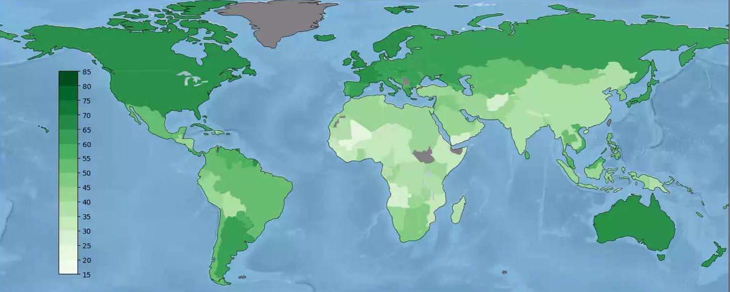
Posted to Reddit's
Data is Beautiful subreddit (
cf.), this animated map shows the
growth in life expectancy for children born since 1960. Things get better, slowly. I'd expected to see declines in some parts of the world, and there are some temporary setbacks -- post-Soviet Russia drowning in the 1990s and subsaharan Africa at the
height of the AIDS crisis, for example -- but it appears that nowhere is worse off now than in the past.
