
Editor's note: Forty years ago today, NASA launched Voyager 1, the second of two spacecraft on a grand tour of the solar system and into the mysteries of interstellar space. Attached to each spacecraft is a Golden Record containing Earth's greatest music, spoken greetings, "Sounds of Earth," and more than 100 images encoded as audio signals, a technological feat at the time. Technical director Frank Drake had always planned to encode the photos in the audio spectrum for the record. The challenge was finding technology capable of the task. While flipping through an electronics catalog, Valentin Boriakoff, Drake’s colleague at the National Astronomy and Ionosphere Center, stumbled upon Colorado Video, a small television equipment firm in Boulder that had built a unique device for encoding television images as audio signals that could be transmitted over telephone lines. Donating their time and expertise to the project, engineers at Colorado Video projected each Voyager slide onto a television camera lens, generating a signal that their machine converted into several seconds of sound per photo. A diagram on the aluminum cover of the Golden Record explains how to play it and decode the images. Four decades later, Ron Barry followed the instructions.
How I decoded the images on the Voyager Golden Record
The video above is a decoding of more than 100 images that were packed into the audio channels of a record that was placed on each of the Voyager spacecraft. How does one pack data into audio? (Remember modems?) This article doesn’t answer that question directly, but it does attempt to reproduce the efforts an alien would go through to recover those images. I tried to keep the conversation high-level enough to be broadly accessible, but still give enough detail that an interested masochist could reproduce (and, hopefully, improve upon) my results.
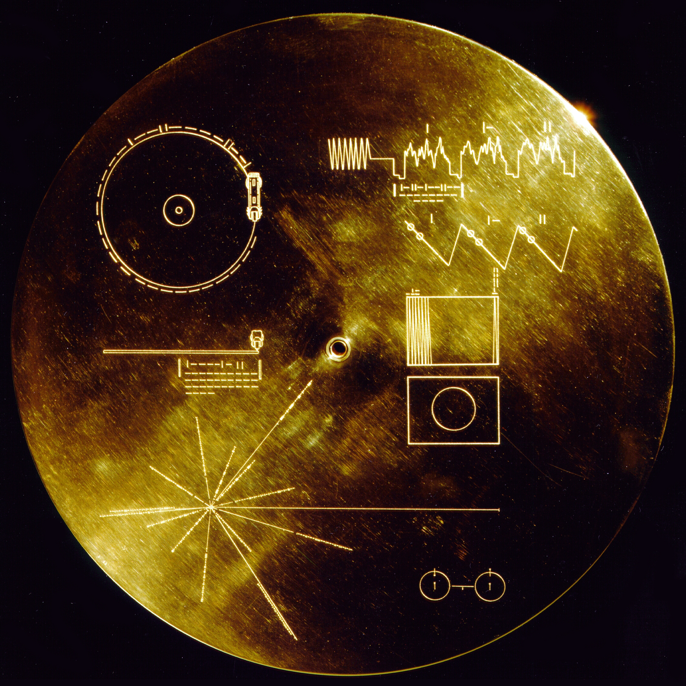
It was something of an accident that I recently met David Pescovitz. He had and his Ozma Records partner Tim Daly organized a panel at the Exploratorium in San Francisco, covering the design and production of the Voyager Golden Record, as well as the upcoming public release of a vinyl edition that he co-produced. During the talk, an image of the record’s cover was displayed behind David and his guests, Timothy Ferris and Frank Drake, the producer and technical director, respectively, of the Voyager Record in 1977:
 The Voyager Record Cover
It’s an iconic image, familiar to most space exploration enthusiasts, but I’d never taken the time to really study it. I have a background in computer graphics, so the zig-zag lines in the rectangle, just to the right of the hole, were recognizable to me. They suggested the scan lines of a television or computer screen. The repeated instances of |, |-, || also suggested to me that these were enumerations in binary (1, 10, 11.) The puzzle began to drag me in, and I continued to work through it, trying to track the talk while getting my puzzle geek on.
The next twenty minutes pretty much doomed the next two weeks of my spare time.
I can’t say that I was 100% certain of how the encoding worked, but I was crystallizing a few guesses. First, the scan-line image starts with the 1, 10, 11 enumeration and continues to 100000000. When converted to decimal, this value is 512, so I knew I’d be seeing images with 512 columns.
The waveform at the top suggests that the audio would somehow be broken down into pixel values, though I had no guess as to how this would work until I started poking at the data. I guessed that the 101101001100000000000000 under the waveform was telling me how long it would take for the audio to play one “trace” (a single stripe of pixels), but I had no clue what the units on that number were. That number works out to 11,845,632 in decimal, so I knew that the time interval had to be very, very short. It seemed sensible that the key to the timing was on the record cover, but I was having a hard time working it out.
Unfortunately, I had gotten about this far when someone asked Dr. Frank Drake to explain what the hieroglyphics meant. What was obviously a record stylus had suggested nothing to me. How is an alien Kerbal supposed to know what a record stylus is? Dr. Drake resolved that one quickly enough: a stylus is provided with each spacecraft.
The starburst thing - bottom, left - was a total mystery to me. Dr. Drake covered that, as well. It’s navigational information - distances and directions to local pulsars. It’s a way for the Kerbals to figure out where our sun is. The two glyphs above the starburst suggested record play time and record rotation time, and that eliminated all but the barbells at the bottom right. I took a stab in the dark that it had something to do with helium oscillation... and was dead wrong. Dr. Drake asserts that any chemist worth their precipitate would instantly recognize that the diagram represents the time it takes for a hydrogen atom’s electron to change states. Let’s just say that I barely passed freshman chemistry, so I’m not exactly Dr. Drake’s target audience on that one.
The hydrogen/electron/transition thing was a spoiler, I have to admit. Though, if I were actually a Kerbal, I wouldn’t know anything about a record to begin with, so just being human means I already had a quite few spoilers in hand. Maybe, if I were twenty years younger, I wouldn’t have known what a record was and I wouldn’t have had the hint that the marks on the upper-left diagrams were timing information? I think I got that from the waveform, but I can’t say for sure how I pieced it all together.
I spoke with Dr. Drake and David Pescovitz after the talk, and asked if anyone had high-fidelity digital versions of the image data. David not only had gotten access to the master tapes for his anniversary vinyl edition, but happily provided me with a copy of the image data audio!!!
From that point on, I was determined to play the part of the Kerbal who recovers Voyager and its audio legacy from deep space, puzzling out how to extract the message it contains. I refused to do any research that would result in human-specific knowledge. Any science or math that would be universal (as in, known to any intelligent civilization in the universe) was fair game, but anything else was off-limits.
I brought up the data in Audacity, a free audio editing package, and worried that I’d made a mistake. The Golden Record cover glyph shows a sawtooth wave, followed by image traces. I found the sawtooth wave easily enough, but what followed didn’t match the timing information on the cover. The recording is chock-full of waveforms that look something like this:
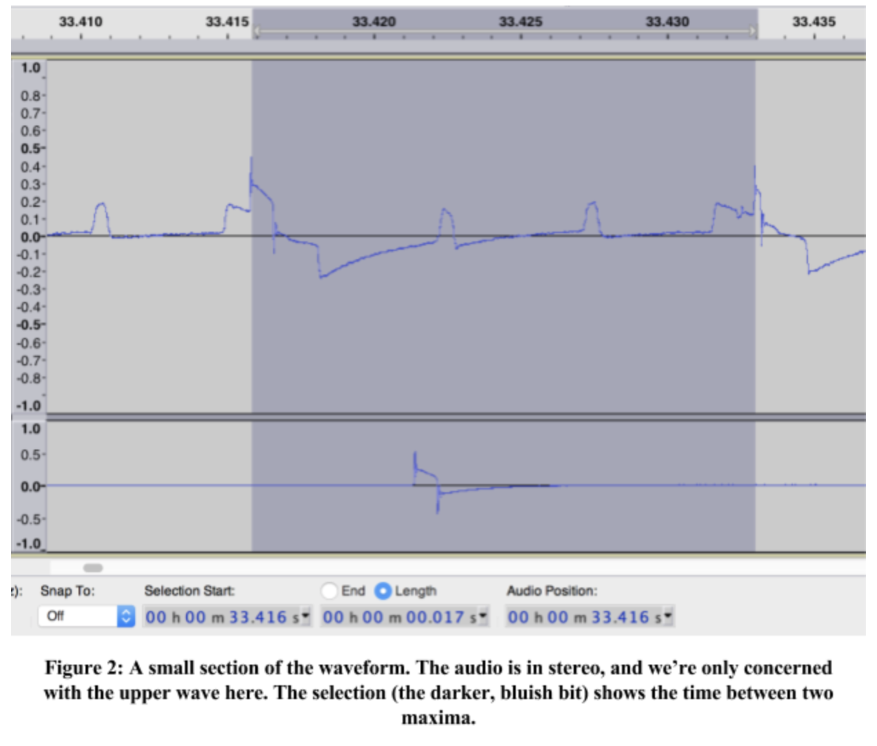
I’ve selected one full trace to demonstrate my issue. It’s 0.017 seconds long (actually, 0.001667s.) Unfortunately, my math from the cover told me to expect traces to span 0.00834s. I had no idea how much of the record was dedicated to images, so I couldn’t use the playtime (middle glyph, left column) to check, and wondered if there was something wrong with the data. I checked with David, who confirmed that there’d been concern that the master tapes had been recorded at an unusual tape speed, and that they thought they should have been 2x faster. This perfectly matched my math, and I was once again a happy Kerbal.
I don’t consider this to have been cheating. The Kerbals will have the actual copper records in tentacle/hand/pseudopod/hoof. All I was doing was verifying that my data matched what our little green friends will be able to extract from those records.
Knowing that each image was 512 traces long, and each trace was roughly 8.3ms, I knew that each image would be about 4.2 seconds of data. It was easy enough to spot a regular pattern of 4.5-second… uh… thingies in between some noisy… uh… thingies. Yeah. I know almost nothing about Digital Signal Processing (DSP). I toyed with some fairly hackish solutions for finding where each image started, but in the end I went totally low-tech. In Audacity, I zoomed in on waveforms, manually found where sawtooths ended and traces began in each image, and hard-coded them into my project. It was slow going, but not as slow as me fixing this particularly gnarly gap in my education to cobble together some byzantine disaster of an analysis. I have a passing familiarity with Fourier’s mathematics, but zero experience applying it. The Kerbals are stuck going low, low, low tech on this one. Welcome to the digital stone age.
I’d measured the length and width of the image glyph on the record cover and found it to be almost exactly four-thirds as wide as it is tall, so I chose to use an image size of 512 pixels wide (given from the cover) and 384 tall, computed by this 4-to-3 ratio. It seemed to make sense that, if the images were going to be square, they would have drawn them as squares. If they were to be rectangular, a ratio of small integers would be a good bet. (This guess was pretty close, but eventually had to be modified by a couple percent.)
My first approach was to just draw every vertical trace as though it started with the maximum sample, running to the next maximum. (In Figure 2, I selected the samples between one maximum and the next.) The distance between these peaks varied, so before turning each trace into pixels, I had to find the highest point that was 3000-3400 pixels ahead of “now”, then condense those samples down to 384. So I’d need to generate a pixel intensity for every 7.8-8.6 samples.
For a first pass, I thought I’d set the pixel brightness to highest value in those samples. This worked well enough that, with some modification, it is the method I used for the final product. My first rendering of the first image on the left audio channel… had some issues:
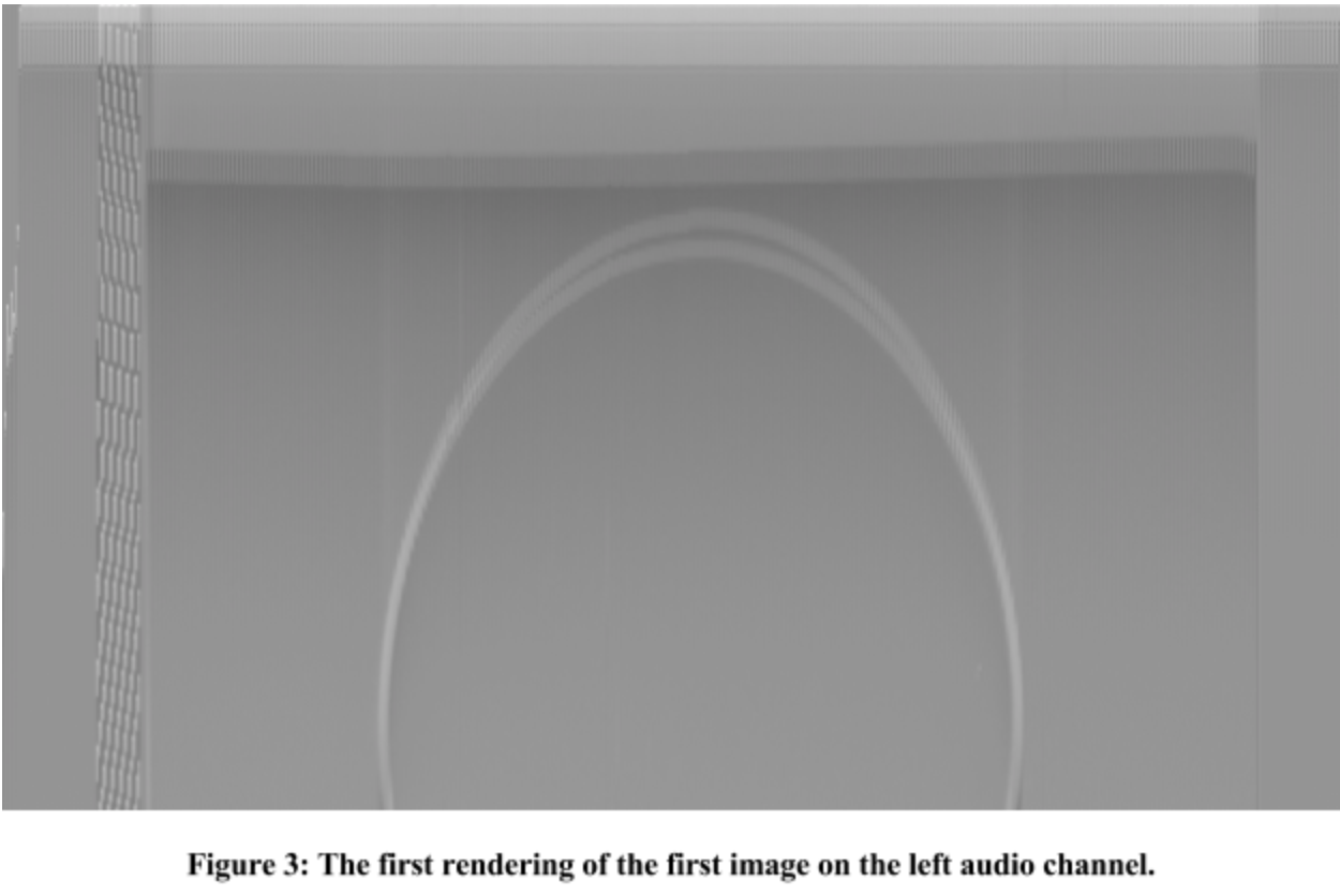
It didn’t take long to figure out that I’d made a classic mathematical blunder (not quite as grotesque as getting involved in a land war in Asia, but close enough). I’d used the image width as a divisor instead of image height in computing my sample pitch rate - I was traversing the image far more slowly than 7.8 samples per pixel. That’s why the circle was stretching off the bottom of the image. You can see an improved rendering in Figure 5.
Of note: this image is closer to 640 pixels wide. I wanted to render a bigger chunk of the audio to get a better visual clue of what was going on in that data than Audacity could give me. So there’s some garbage to the left and right, but you can start to get an idea of where the intended image bounds are.
If you look at Figure 2 again, you can actually see the trace as it passes over the circle. The first “bump” in the trace is where that vertical column of pixels first encounters the circle, and draws brighter pixels. The second “bump” is where the trace draws the brighter pixels for the bottom of the circle. In Figure 3, above, you can see that what should be a circle is really two circles, each drawn on alternating vertical lines. In looking at my data, I found that the widths of traces were alternating between about 3100 and 3300 samples. The unmistakable interpretation is that I was not finding the correct start location for the vertical traces.
I was calling this annoyance “The Jitter Problem,” due to the interlacing artifacts in all of the output images. I was unsure of what to do about it. Again, with no background in DSP, I had limited tools with which to attack the problem. That circle in the very first image came to my rescue, though.
The maxima I had used as trace boundaries… clearly weren’t. They are separated by ~3100 samples, then ~3300 samples, then 3100, then 3300, 3100, 3300. I killed this problem by looking for the bottom of the falling edge, 40-140 samples after that maximum. These troughs are separated by a far more consistent span of about 3200 samples.
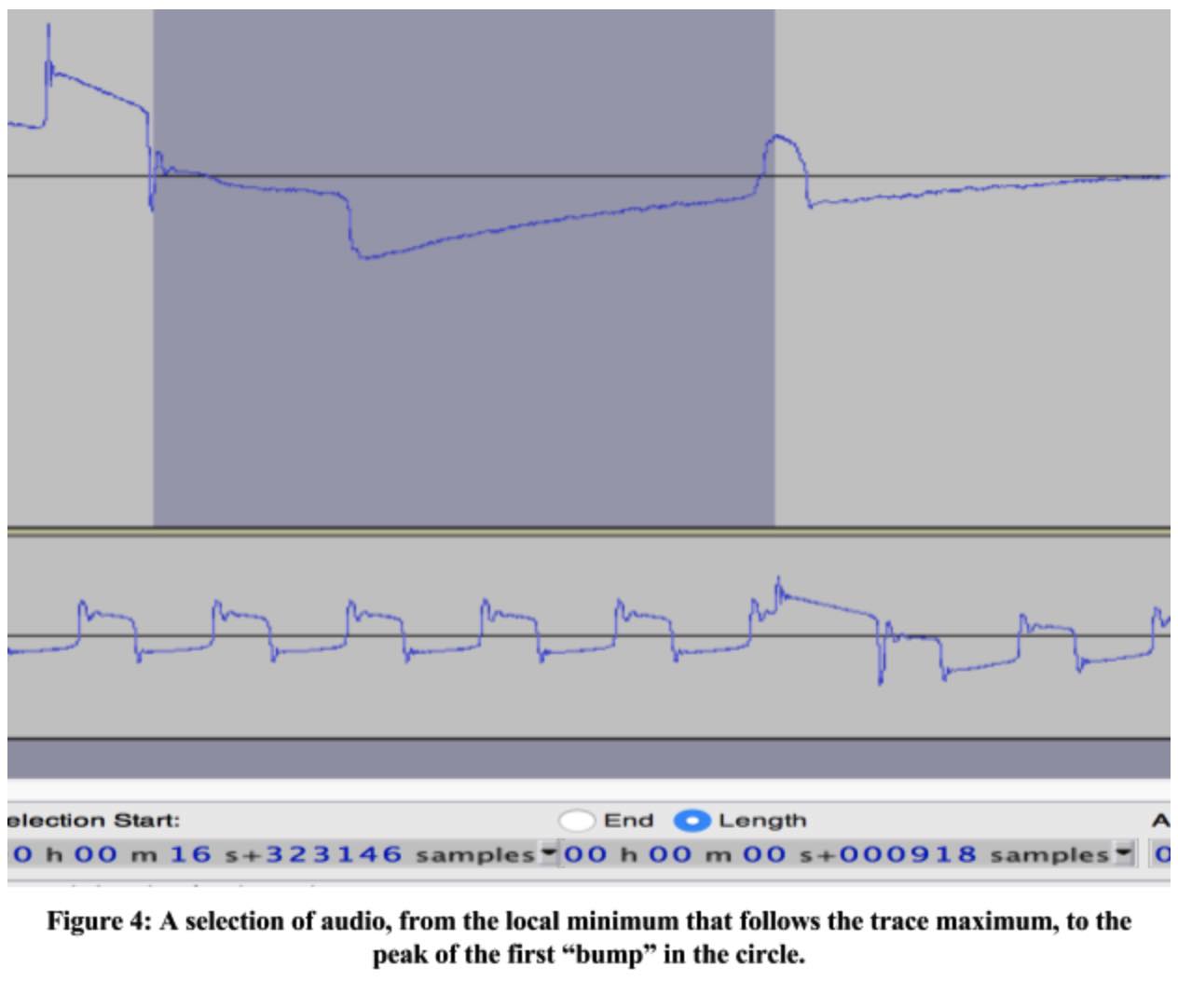
It sounds ad-hoc, but there was a method to my madness. It stands to reason (look at the record cover’s example of the circle image) that the circle is centered in the image. This means that every trace should have the same amount of space from its start to the first “bump” in the circle, and the last “bump” to the end of the trace. Given that the ad-hoc trace boundaries alternate between 3100 and 3300 samples, we can assume that a proper trace is about 3200 samples long, so all I had to do was measure the distance between the circle peaks of one trace (1364 samples) and subtract that from 3200 (to get 1836 - the number of samples outside the circle.) Dividing this by two, there must be 918 samples on either side of the peaks, which confirmed my hunch:
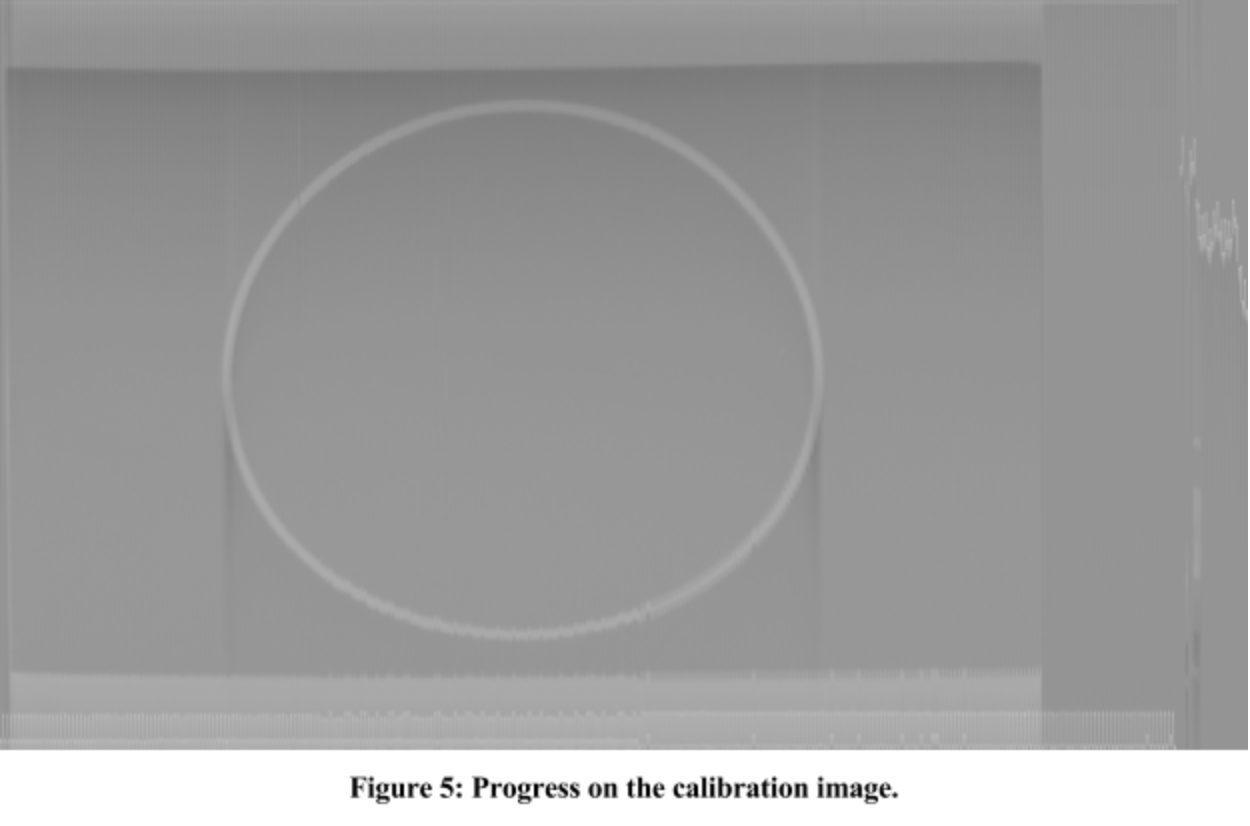
The Jitter Problem still haunted me - though far more subtly - but at least my circle was now a single circle. I found that nearly every image had the same jitter characteristics. Every other trace would be off by a certain amount, starting with the 164th trace, off by another amount starting with the 2xxth trace… yeah. I fixed the problem with a brainless heuristic instead of figuring out how traces are supposed to be detected.
Below the circle, you can see a “shadow”. Above the circle, there’s an “anti-shadow”. You may notice that the number of bright pixels in a column affects how intense the shadow and anti-shadow pixels are in that column, as well as how far they extend after or before (respectively) the bright pixels. This is an issue that I haven’t yet dealt with, though I have a number of ideas that I believe will clear up my images considerably.
Due to either an effect of the way the data were encoded, or the way they were sampled off the master tape, the image is darker at the top than at the bottom. If you look again at Figure 2, you can see that the trace trends upward over time. I would expect this image to be white-on-black or black-on-white, not gradient-on-gradient. I have seen this sort of thing before, when trying to use the audio auxiliary-in port of my computer as a poor-man’s oscilloscope. I was driving that port from the LED on a remote control that I wished to reverse-engineer. I knew that the LED would produce a square wave, much like what I would expect the circle image to consist of, but instead I saw spikes, followed by exponential decay back to ground. At the time I was able to shrug it off because I was just after timing data, but here it’s interfering with my image quality. It’s on my list of things to try to devise a fix for.
I can’t resist including this. It’s the waveform for the circle, plus a couple seconds of lead-in. You can clearly SEE the circle in the rendering:

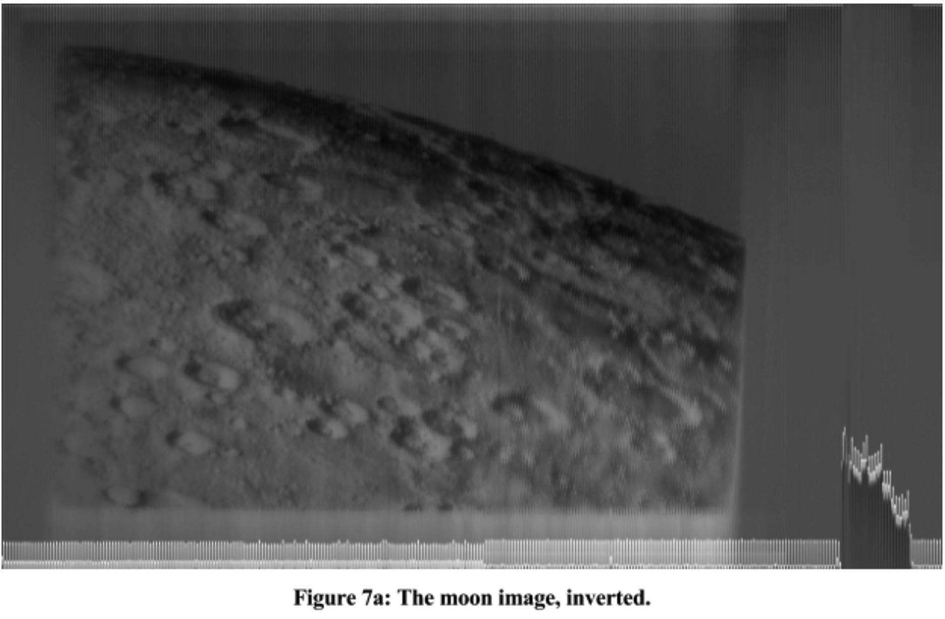
I wasn’t making decoding decisions based strictly upon the features of that first image. The circle gave me a very clean visual, with which I could calibrate my process, but I was still checking my progress against the other images in the data. Figure 7a, below, had been bothering me for a while, but I’d been so focused on trace boundaries, jitter, aspect ratios, shadows/anti-shadows, that I’d not really paid it much attention. It finally occurred to me that, if this image were lit from the bottom left, the shadowed part of the moon should be the same darkness as space behind it. I eventually realized that my images were inverted - negatives of themselves.
Negating the image gave a much better - and more believable - result.
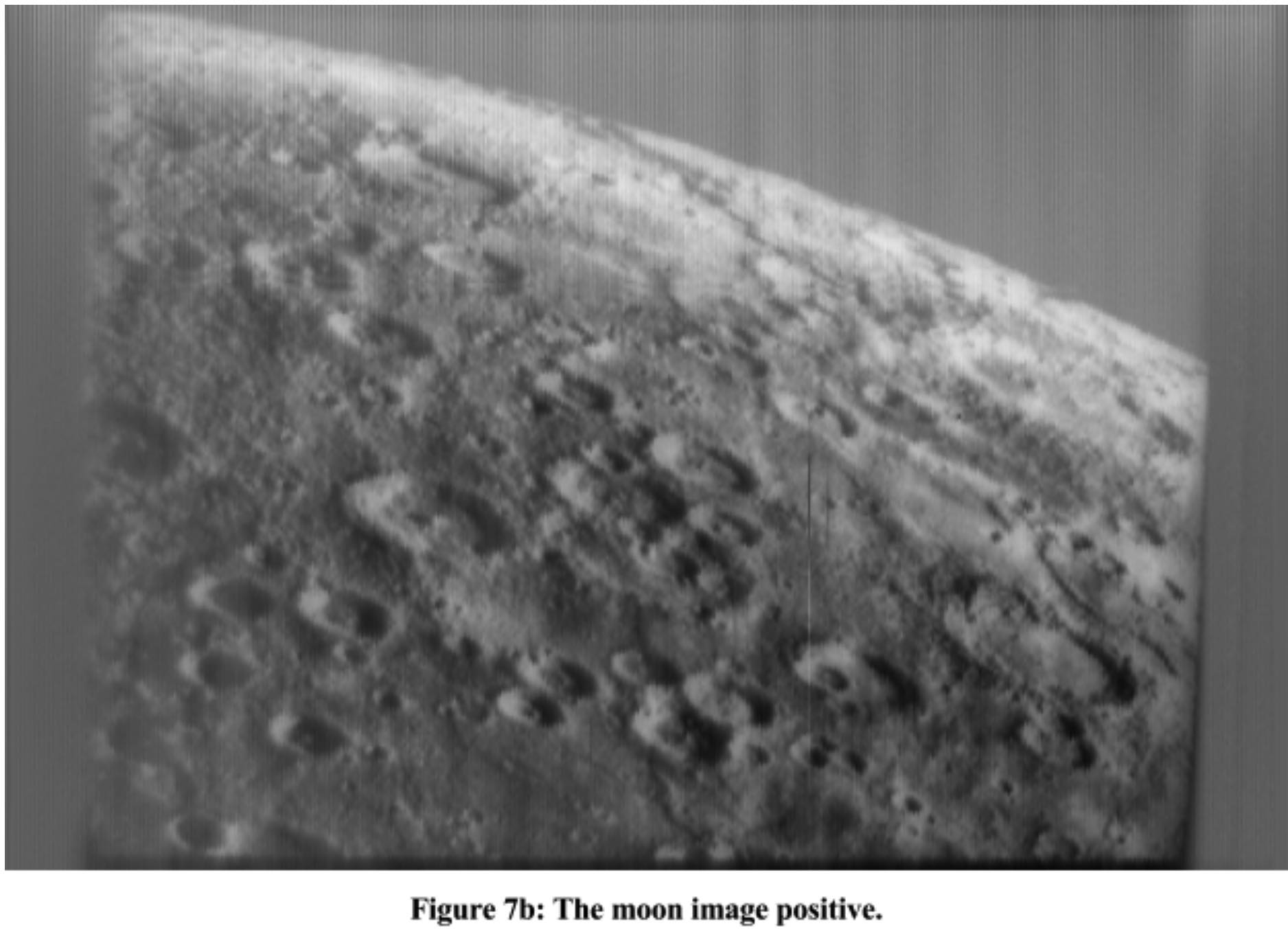
By now, I had a decent preview of all the images. They were very low-contrast, so I experimented with some expansion functions to enhance the detail in the middle range while throwing some out in the whites and blacks. As this wasn’t a very Kerbish part of the project, I’m going to skip any further discussion on the topic.
This set of slides was the next hurdle.
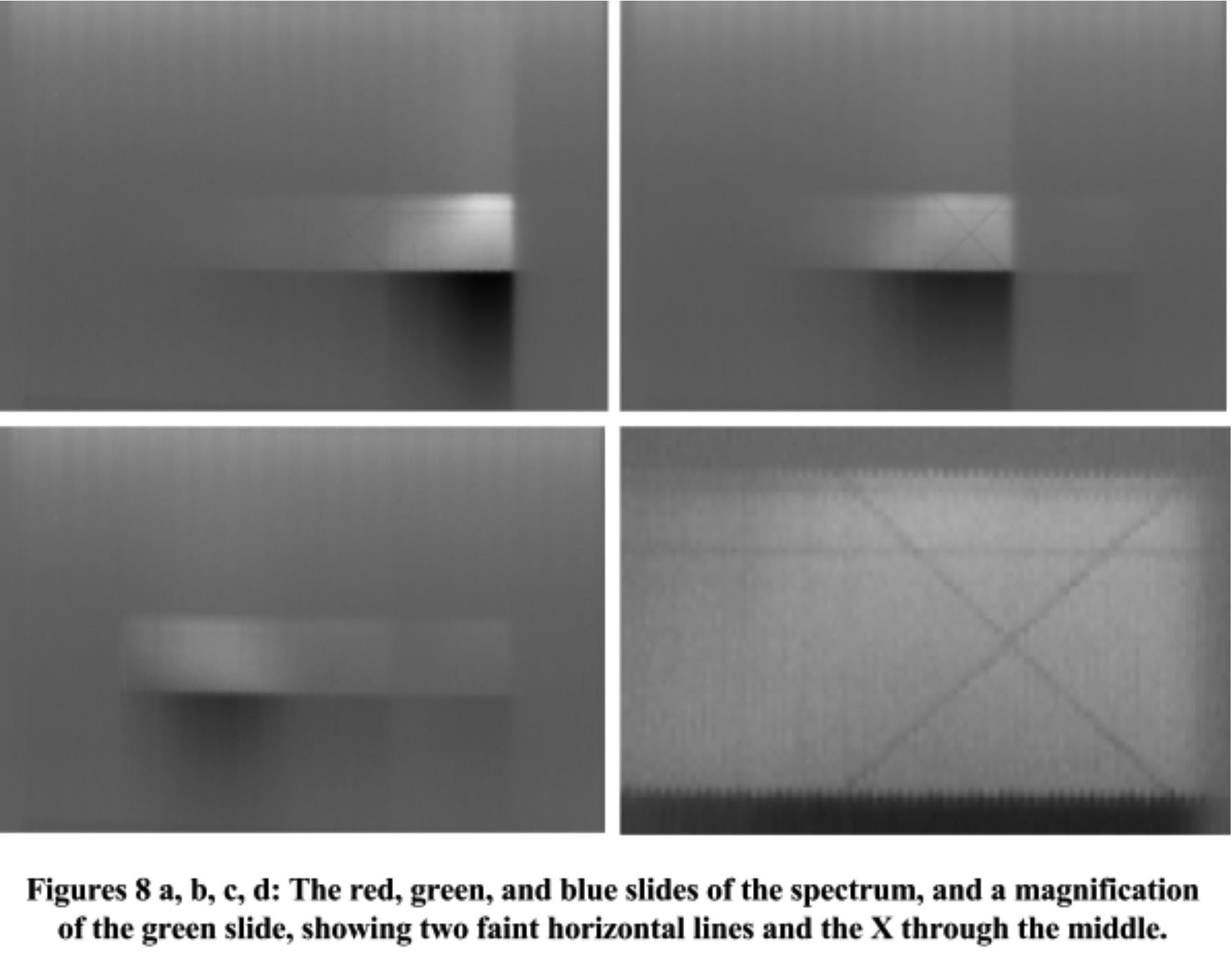
I had a pretty good idea of what was going on here. One other spoiler was that I was aware that some of the Voyager images were in color, though I’d no idea what the process of conveying that information to the Kerbals would be. These slides were a dead giveaway to me because I’m color deficient and have taken a deep interest in the topic of human color perception for most of my life.
I knew what was being communicated, but I needed to figure out how the Kerbals would work that out before proceeding. I hated these slides. At the time I first saw them, I was still having major contrast issues, so there was ZERO detail in them. They were greyish rectangular blobs. Even boosting the contrast considerably, it’s incredibly difficult to spot any information. There’s an X in the middle of the second image, and all three appear to have two very faint, horizontal lines through them. I’ve no clue how these are telling Kerbals anything at all. I would guess that the X is where human luminous efficiency is at its peak, but I’m clueless.
One of many, many guesses finally paid off. Under certain conditions, every element has a specific set of frequencies of light that it absorbs, corresponding to the differences in energy levels between its electrons’ orbits. When a hydrogen atom is hit by a photon, if that photon’s energy exactly matches the energy required to bump the atom’s electron up by an orbit or two, the photon is absorbed and the electron jumps. Passing white light through hydrogen, then splitting it with a prism will give a characteristic spectrum, minus some fine black lines at the absorption frequencies of hydrogen. Those lines are a fingerprint for the element and, while they’re present in the slides, they are represented so faintly that they are nearly impossible to spot. It doesn’t help that hydrogen absorption lines are rare in the visible range:

There’s one in the red/green range, and most of the rest are so deep in the blues that they’re very hard to spot on the left of the third slide. It made sense to use this method for conveying color information, especially since it allowed the communication of the intensity of our color sensitivity across the spectrum. For example, by varying the intensity of the spectrum slides to match the spectral intensities that the cones in our eyes pass, the slides could tell you that we are far more sensitive to green than red, but they don’t appear to. I’m not sure why not. As I said, the mechanism made sense to me, but could have been made far more effective. I would have liked for them to draw in dark bars to highlight the locations of the absorption lines, instead of just using a photo of a projected spectrum.
Then again, maybe this is just another consequence of my substandard education in chemistry.
I believe that the slide preceding the spectral images is part of the color Rosetta Stone:
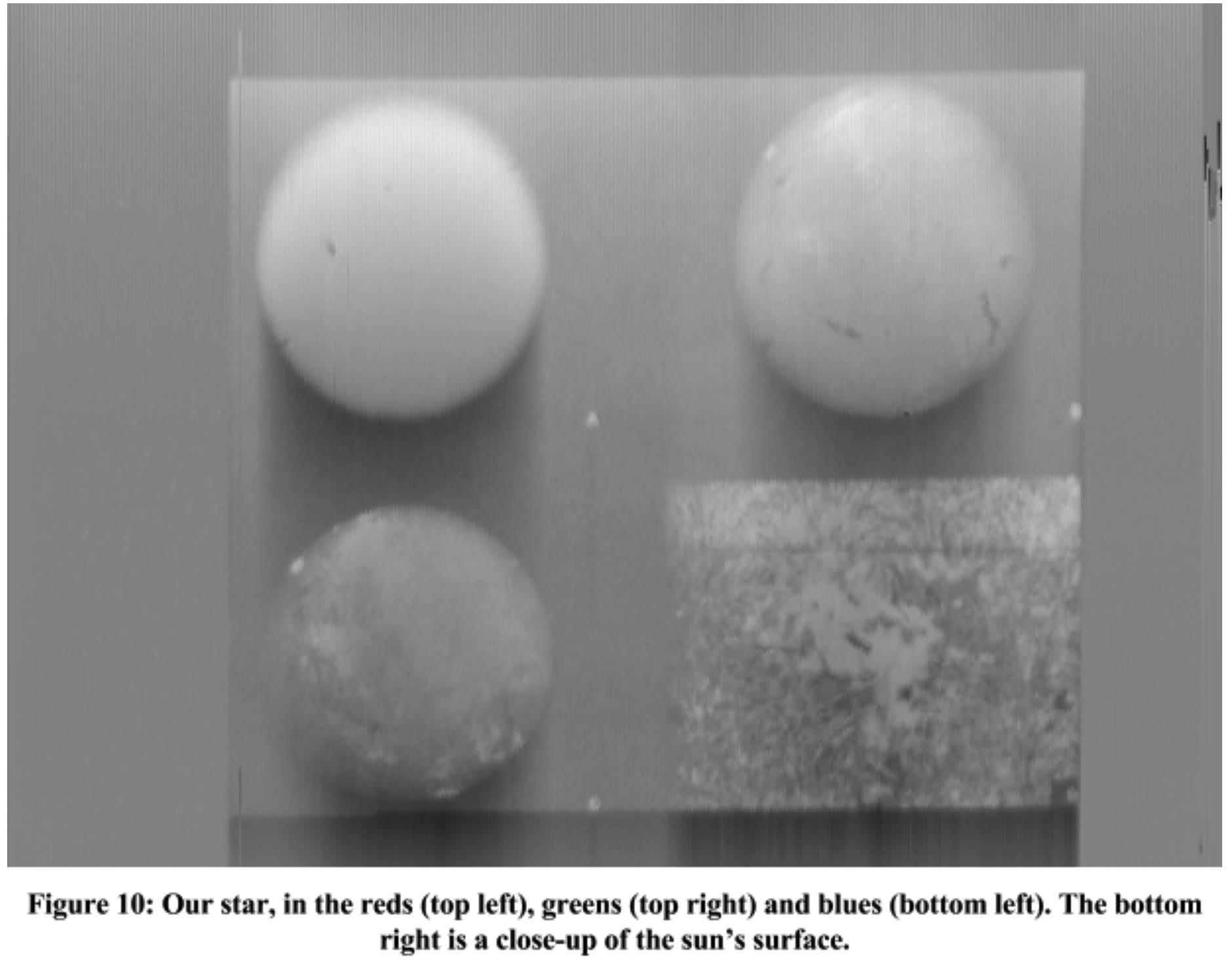
I must have seen this image go by a dozen times before I realized what it was. (Remember, my first few days of this work were producing very low-contrast images.) It’s our sun. The bottom-right image should be recognizable to an astronomer as the surface of a star. Maybe some feature that is particular to a star of our type? Armed with this knowledge, that same astronomer might recognize the three spheres as renderings of a star of that type, in the reds, greens, and blues. I’m way out on a limb here. I’ve not tried to reconstruct the star image, so I’ve not tested this hypothesis in any way.
A friend has suggested that it’s here to help identify our sun. The record cover is a map to a number of local pulsars, so perhaps this slide is here to disambiguate which sun is us. After all, in the timeframe that Voyager is expected to last, we’ll orbit the galactic center a half-dozen times, and our proximity to those pulsars will change. The quality of the navigational data will lose accuracy over time. Giving more information about which sun is ours will help the Kerbals find us.
Anyway, armed with the key for converting triples of images, I turned this:

Into this:
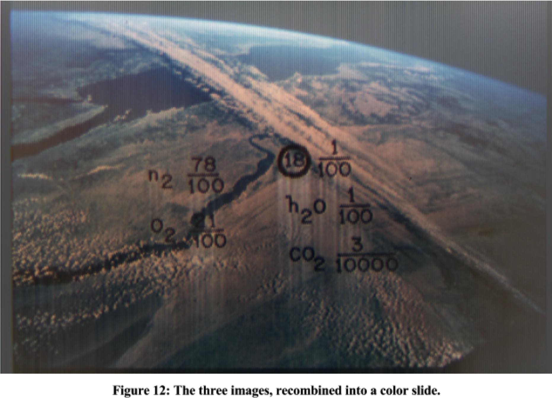
And, while I’ll be the first to admit that I still have a lot of work to do - some of my red/green/blue images aren’t vertically aligned, producing color ghosting, there’s jitter to fix, I need to implement my shadow/antishadow solution, etc. - I was satisfied enough with the result to produce the video.
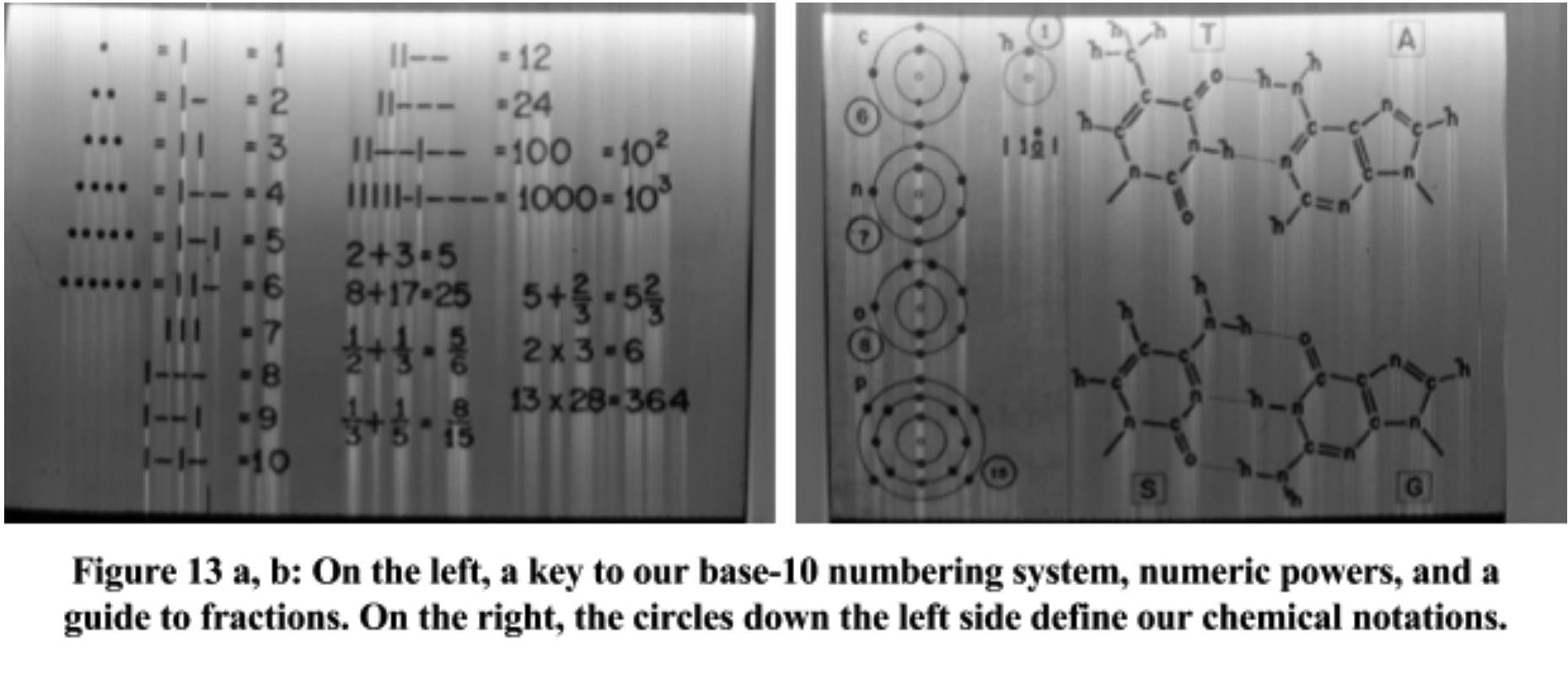
If you’re curious about how the Kerbals will make sense of the text on that last slide, previous slides give a crib for how our numbers work, and another shows how our chemical notation works:
I’ve placed all of the raw decodes (as .ppms and .pgms) and their .jpg equivalents in a shared drive folder Apologies, but the jpeg naming sucks. The only reason the jpegs exist is for distribution. The naming of the raws is sensible in my code. The .pgms are raw, uncompressed greymaps of each image, taken straight from the audio processing. For each .pgm, there’s an equivalently-named .jpg that your browser will probably be happier with. The .ppms are raw, uncompressed color images, created by combining three images into one. For each .ppm (like LeftChannel_009.ppm) there’s a jpeg with a .color.jpg extension (like LeftChannel_009.color.ppm). I should have renamed all of this before I uploaded it, but I’m working on other priorities. =]
Extracting all 156 greymaps and 20 pixelmaps takes about 10-15 seconds of CPU time and chews up a meager 42M of disk space. Outputting the video’s real-time versions, where I write a pixelmap for each 1/30 of a second of audio, takes around 10 minutes, generates 28,000 files, and bites off 17G of hard drive space. Creating the waveform images for the video takes a couple minutes, kills another 28,000 files and 7.8G. The compositing process, where I generate all the final video frames, combining two images and two waveforms, takes 20 minutes, plops out 15,000 files at a whopping 39G. The image format I used for the last stage was all .ppm. It’s incredibly easy to read and write (MEMORY MAP), is CPU-cheap, and lossless. The final video was rendered with ffmpeg and took about 20 minutes to complete:
ffmpeg -v info -y -f image2 -thread_queue_size 32 -r 30 \ -i ./final_video/video_frame_%05d.ppm -i \ 384kHzStereo.mp3 -threads 8 -shortest -s:v 1280x720 \ -r 30 -b:v 6M -preset veryslow voyager_6m.mkv
Yes, the audio’s an .mp3. I had to downsample the blessed waveforms for the sake of uploading to YouTube.
TODO:
• I found the images themselves to be their own fun little puzzles to play through, so I’ll leave that investigation to you and Jebediah Kerman. There remain quite a few things on my TODO list, though;
• Fix the 1-2 remaining color images that have a channel that is off by one pixel. The Jane Goodall photo, for example.
• Solve the problem of the decay bias. Why do the images start bright at the top and tend darker? Is this something that was on the vinyl, or just an artifact of the way the master tape was digitized?
• Spend more time looking at how the traces are bounded. There must be something my heuristic missed, since I still have a couple images with major problems.
I had hoped that there was more fidelity in the data than I’m extracting. Unfortunately, some spoilers kick in at this point. Each trace goes by in 8.3ms and represents 364 pixels. This means that each pixel is represented by 0.0023ms of data. In other words, pixels are flying by at a rate greater than 43,000/s. 43kHz is well above the limits of human hearing, so it is unlikely that 1970s recording equipment would have been capable of carrying that frequency. In other words, while I’m displaying 364 pixels per trace, my data doesn’t actually contain that much data. The images are being vertically magnified in the decoding process.
• There’s an awful lot of unused data in the audio. Images start 5.75 seconds apart, but more than a second of that is data that I haven’t identified. It looks very regular, like it’s only there to help you automatically find the boundaries of images, but that feels like a lot of waste. They could have reduced that waste down to 50 milliseconds and made enough room for another couple dozen images, so I’m still suspicious that there’s something there that I’m missing.
Special Thanks
• David Pescovitz - For the source material and extended patience with my “WOW!” moments during this process.
• Brian Scearce - For a badly needed proof-read.
• The Blue Tang Grammar Hotline - I’m not sure I can afford the bill.
• Anyone who has had to listen to me yammer about this thing since I started… Hey, at least you got a break from the hang gliding geekery for a few days!
The Voyager Golden Record is now available as a vinyl box set or book/CD from Ozma Records.
Here is the image data audio from the original master tapes: